Hi friend! If you clicked on this post, it’s probably because you’re questioning the color palette for your coaching brand. Great! Colors are (in our opinion) the most important thing to get right when developing your visual identity and branding.
Colors convey a ton of information on a subconscious level, so they need to be thoughtfully chosen for your business. By the way, we’re Cass and Tee, certified coaches and Co-Founders at Lovely Impact, a branding and website design agency for coaches.
At Lovely Impact, we agonize over the color choices for each and every one of our branding clients, and we’re hoping to share some of what we know with you so you can make educated color decisions for yourself. In this post, we’re breaking down:
- Why Color Matters in Branding
- The Meanings of Colors in a Brand
- How to Choose the Right Colors for Your Coaching Brand
Why Color Matters in Branding

Think about your favorite brand, whether it’s a store, a product, or something else. Picture it in your mind. Imagine their website, emails, or packaging. Got it? Good.
Now replace the main color of that branding with neon green in your mind. Can you see it? And now seeing it, would it change your perception of that brand? Probably, although you might struggle to admit it.
Colors play a huge role in influencing our decisions on whether or not to buy something, work with someone, or trust things. It’s wired into our brains, passed down over decades and centuries of human experience. Certain colors make us feel safe, others make us feel energized, and some make us wary before we even consciously recognize why.
Now apply that to your coaching brand. The colors you choose are not just about what looks good together. They shape how people feel the moment they land on your website, see your social media posts, or receive an email from you.
Here’s why color matters in branding:
- It Triggers Emotional Responses. People associate colors with feelings. Blue feels stable and trustworthy. Red creates excitement. Green signals growth. Your brand’s colors set the tone for how people experience your business.
- It Builds Brand Recognition. Studies show that color increases brand recognition by up to 80%. Think about how easily you recognize McDonalds’ yellow arches or Tiffany’s signature blue box. A well-chosen color palette makes your brand memorable.
- It Reinforces Brand Personality. Whether your brand is warm and welcoming, bold and confident, or calm and nurturing, your colors help communicate that before a single word is read.
- It Subconsciously Influences Decisions. Color psychology plays a major role in consumer behavior. For example, fast-food brands often use red and yellow because they encourage appetite and action. Luxury brands favor black and gold to signal exclusivity. Your coaching brand should use colors that align with the emotions you want potential clients to feel.
- It Creates Consistency Across Platforms. Using a defined color palette across your website, social media, emails, and marketing materials builds trust. When your colors are cohesive, your brand looks polished and professional. When they’re all over the place, your brand feels scattered and unintentional.
Color is not just decoration. It’s strategy. Choosing the right colors for your coaching brand helps create a subconscious connection with your audience, making them feel aligned with your business before they even realize why.

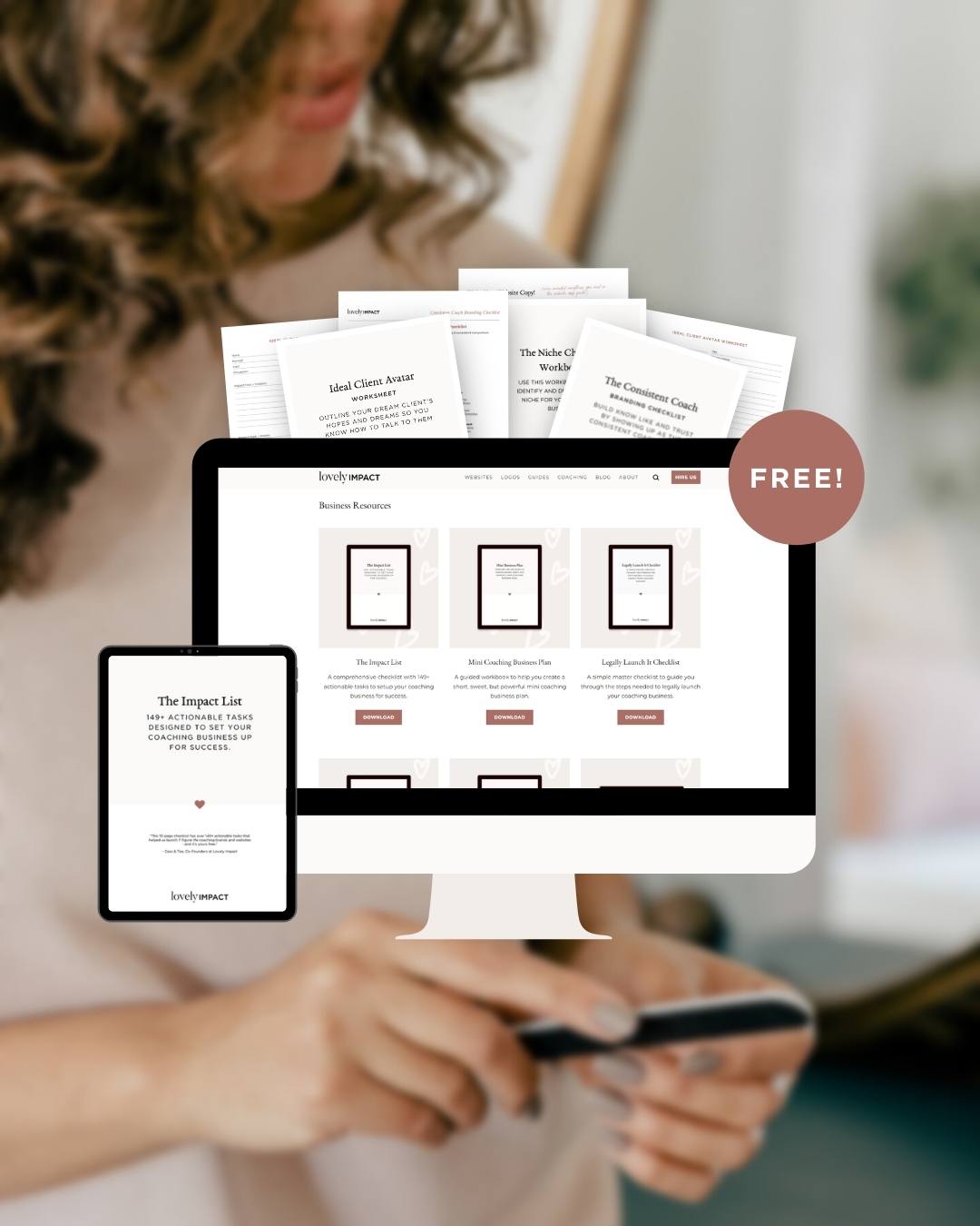
Free Canva Moodboard Templates For Coaches!
Fill out this form to access our free Canva mood board templates that you can use to create your own mood board for your coaching business.
Plus, join our email list to stay up to date.
Now that we’ve established why color is so important, let’s break down what different colors actually mean in branding.
The Meanings of Colors…aka Color Theory & Color Psychology
Every single color communicates something slightly different, and while there is some overlap, it’s the nuances that you really need to pay attention to. While we can’t give you the meaning of every single shade of blue (that would take ages to write and read), we hope you can at least get a sense of what your chosen colors are saying about your brand.
Let’s take a look.
The Meaning of Red

Positive Associations: Passion, Energy, Strength, Power, Determination, Love, Excitement, Confidence, Courage, Leadership, Action
Negative Associations: Danger, Aggression, Anger, Warning, Overstimulation, Urgency, War
How Red is Used in Branding and Design
Red is a high-energy color that demands attention. It is often used to create a sense of urgency, which is why you frequently see it in clearance sales and fast-food branding. It can also evoke deep emotional responses, making it a powerful choice for brands that want to inspire action and intensity.
When to Be Cautious:
Because red is such a bold and intense color, too much of it can feel aggressive or overwhelming. If you use red in your branding, consider balancing it with neutral tones or softer colors to prevent it from feeling too harsh.
Best Types of Coaches for Red Branding
Red is a great color choice for coaches who want to communicate passion, strength, action, and bold leadership. It works best for coaching businesses that focus on motivation, power, and high-energy transformation.
The Meaning of Orange

Positive Associations: Enthusiasm, Creativity, Adventure, Warmth, Playfulness, Motivation, Optimism, Confidence, Sociability, Courage, Friendliness
Negative Associations: Impulsiveness, Superficiality, Overstimulation, Frustration, Risk, Lack of Seriousness
How Orange is Used in Branding and Design
Orange is a dynamic and energetic color that blends the excitement of red with the warmth of yellow. It is often used to create a sense of friendliness, approachability, and enthusiasm. Brands that want to stand out as fun, creative, and high-energy often incorporate orange into their branding. It’s also a popular choice for brands that focus on innovation, transformation, and new experiences.
When to Be Cautious:
Because orange is such an energetic and playful color, it may not work well for brands that want to convey sophistication, luxury, or calmness. When it’s overused, it can feel overly casual or lack depth. Pairing orange with a more neutral color like navy, gray, or white can help balance its vibrancy.
Best Types of Coaches for Orange Branding
Orange is an excellent choice for coaches who want to project energy, creativity, and enthusiasm. It works best for coaching businesses that focus on growth, change, and innovation.
The Meaning of Yellow

Positive Associations: Optimism, Happiness, Warmth, Creativity, Positivity, Clarity, Intelligence, Energy, Youthfulness, Joy
Negative Associations: Caution, Anxiety, Impulsiveness, Cowardice, Overstimulation, Lack of Stability
How Yellow is Used in Branding and Design
Yellow is an uplifting and cheerful color that radiates positivity and warmth. It is often used to convey optimism, creativity, and happiness. Many brands use yellow to create a welcoming and friendly vibe, making it a great choice for businesses that want to feel approachable and energetic. It is also commonly associated with intellect and mental stimulation, making it an excellent option for brands that focus on learning, problem-solving, and inspiration.
When to Be Cautious:
Because yellow is bright and attention-grabbing, too much of it can feel overwhelming or cause visual fatigue. It is also associated with caution signs and warnings, so it needs to be used thoughtfully in branding. To balance its intensity, pair it with grounding colors like navy, gray, or white.
Best Types of Coaches for Yellow Branding
Yellow is a great choice for coaches who want to communicate joy, clarity, intelligence, and motivation. It works best for coaching businesses that focus on inspiration, learning, and positive transformation.
The Meaning of Green

Positive Associations: Growth, Health, Balance, Renewal, Nature, Stability, Prosperity, Harmony, Calmness, Sustainability, Healing
Negative Associations: Stagnation, Envy, Greed, Materialism, Indecision, Boredom
How Green is Used in Branding and Design
Green is a color of renewal and stability, making it an excellent choice for brands that focus on growth, healing, and sustainability. It is commonly used in industries related to health, wellness, and nature. Many eco-friendly and holistic brands use green to symbolize their connection to the earth and a balanced lifestyle. Darker greens convey wealth, success, and sophistication, while lighter greens feel fresh, peaceful, and organic.
When to Be Cautious:
Green is a versatile color, but the shade you choose matters. Dark greens can feel too serious or corporate if not paired with inviting colors, while bright greens can sometimes feel artificial or overly playful. When using green in branding, consider the emotional tone you want to set.
Best Types of Coaches for Green Branding
Green is ideal for coaches who focus on growth, renewal, and balance. It works well for coaching businesses that emphasize well-being, success, and transformation.
The Meaning of Blue

Positive Associations: Trust, Stability, Professionalism, Loyalty, Wisdom, Reliability, Intelligence, Calmness, Security, Integrity, Confidence
Negative Associations: Coldness, Detachment, Sadness, Passivity, Rigidity, Lack of Emotion
How Blue is Used in Branding and Design
Blue is one of the most widely used colors in branding because it conveys trust, stability, and professionalism. It is commonly found in corporate, financial, and tech branding due to its strong association with reliability and intelligence. In lighter shades, blue feels peaceful and calming, while darker shades convey depth, authority, and sophistication.
When to Be Cautious:
While blue is universally well-received, it can sometimes come across as too cold or impersonal if not balanced with warmer colors. Since it is frequently used in corporate settings, brands that want to feel highly personal or emotional may need to pair it with a more vibrant accent color.
Best Types of Coaches for Blue Branding
Blue is a great choice for coaches who want to communicate trust, expertise, and clarity. It works well for coaching businesses that focus on logic, stability, and deep personal growth.
The Meaning of Purple

Positive Associations: Wisdom, Luxury, Spirituality, Creativity, Intuition, Transformation, Imagination, Royalty, Mystery, Inspiration
Negative Associations: Arrogance, Over-Indulgence, Introversion, Moodiness, Excess, Eccentricity
How Purple is Used in Branding and Design
Purple has long been associated with royalty, wisdom, and mysticism. It is a powerful choice for brands that want to inspire creativity, transformation, and depth. Lighter purples, like lavender, evoke a sense of calm and femininity, while deeper purples feel rich, luxurious, and introspective. Many wellness, beauty, and spiritual brands incorporate purple into their branding to reflect inner growth and connection.
When to Be Cautious:
Purple is not as commonly used as blue or red, which can make it feel unique and bold. However, if used excessively or in very deep shades, it can feel overly dramatic or unapproachable. Pairing it with neutral tones or metallic accents can help balance its richness.
Best Types of Coaches for Purple Branding
Purple is an excellent choice for coaches who focus on intuition, transformation, and personal growth. It works best for coaching businesses that emphasize creativity, spirituality, and deeper wisdom.
The Meaning of Black

Positive Associations: Elegance, Power, Sophistication, Authority, Mystery, Timelessness, Strength, Boldness, Exclusivity
Negative Associations: Coldness, Seriousness, Isolation, Depression, Intimidation, Lack of Emotion
How Black is Used in Branding and Design
Black is a bold and sophisticated color often used to create a sense of exclusivity, power, and high value. Luxury brands, fashion labels, and high-end businesses frequently use black to signal prestige and authority. It can also add a sleek, modern, and timeless feel to a brand. When used as a dominant color, black creates a dramatic and confident brand presence.
When to Be Cautious:
While black conveys strength and elegance, too much black can feel unapproachable, cold, or overly serious. If your coaching brand is focused on warmth and personal connection, black should be paired with softer tones to maintain balance.
Best Types of Coaches for Black Branding
Black is an excellent choice for coaches who want to communicate authority, luxury, and boldness. It works well for coaching businesses that focus on high performance, exclusivity, and deep personal mastery.
The Meaning of White

Positive Associations: Purity, Simplicity, Cleanliness, Clarity, Freshness, Peace, Minimalism, New Beginnings, Balance
Negative Associations: Emptiness, Sterility, Coldness, Perfectionism, Isolation
How White is Used in Branding and Design
White represents simplicity, clarity, and peace. It is often used to create a clean, modern, and refreshing aesthetic in branding. Many health, wellness, and lifestyle brands use white to evoke a sense of balance and purity. White is also a common color in minimalist branding, allowing other brand elements to stand out.
When to Be Cautious:
While white conveys freshness and simplicity, too much white space can feel empty or clinical. If your brand is highly emotional or warm, pairing white with soft colors or natural textures can help make it feel more inviting.
Best Types of Coaches for White Branding
White is an excellent choice for coaches who focus on clarity, balance, and simplicity. It works best for coaching businesses that emphasize wellness, minimalism, and transformational change.
The Meaning of Grey

Positive Associations: Professionalism, Neutrality, Maturity, Balance, Sophistication, Timelessness, Stability, Intelligence, Calmness, Practicality
Negative Associations: Emotionlessness, Coldness, Detachment, Boredom, Indecision, Lack of Energy
How Grey is Used in Branding and Design
Grey is a versatile and neutral color often used to create a professional, balanced, and sophisticated brand image. It is commonly found in industries where trust, logic, and maturity are key, such as finance, technology, and corporate services. Lighter shades of grey can feel soft and modern, while darker greys convey authority and seriousness.
Grey works well as a supporting color in branding because it allows other colors to stand out. Many brands pair grey with bold accent colors like blue, red, or yellow to create a dynamic contrast.
When to Be Cautious:
While grey is a great choice for professionalism and neutrality, too much grey can feel dull, unapproachable, or uninspiring. If your brand is highly energetic or emotional, grey should be used sparingly and paired with warmer tones to add personality.
Best Types of Coaches for Grey Branding
Grey is ideal for coaches who want to communicate wisdom, stability, and professionalism. It works best for coaching businesses that focus on logical decision-making, structure, and grounded expertise.
The Meaning of Brown

Positive Associations: Earthiness, Stability, Reliability, Warmth, Honesty, Simplicity, Comfort, Security, Tradition, Practicality
Negative Associations: Dullness, Conservatism, Rigidity, Outdatedness, Lack of Energy, Harshness
How Brown is Used in Branding and Design
Brown is a grounded and natural color that conveys stability, reliability, and warmth. It is commonly found in brands that want to appear organic, down-to-earth, and trustworthy. Many eco-friendly, artisanal, and rustic brands use brown to symbolize nature, craftsmanship, and tradition.
Deeper shades of brown create a rich, timeless feel, often associated with heritage brands, handcrafted goods, and businesses rooted in authenticity. Lighter tans and beiges feel inviting, warm, and approachable, making them great choices for brands that want to convey comfort and dependability.
When to Be Cautious:
While brown conveys reliability and earthiness, too much of it can make a brand feel old-fashioned or uninspiring. If not used intentionally, it may lack the vibrancy needed to stand out. Pairing brown with warmer tones like gold or green can enhance its richness and prevent it from feeling too heavy.
Best Types of Coaches for Brown Branding
Brown is an excellent choice for coaches who want to communicate stability, authenticity, and warmth. It works well for coaching businesses that focus on nature, wellness, resilience, and traditional values.
Other Common Colors & Their Meanings

- Pink – Femininity, compassion, playfulness, romance, youthfulness, kindness
- Gold – Prestige, success, luxury, wealth, high value, achievement
- Silver – Modernity, innovation, sleekness, high-tech, sophistication
- Turquoise/Teal – Emotional balance, healing, clarity, refreshment, tranquility
- Beige/Tan – Softness, dependability, approachability, tradition, calmness
- Ivory/Cream – Elegance, warmth, subtle luxury, sophistication, softness
- Burgundy/Maroon – Power, wealth, ambition, depth, refinement
- Navy Blue – Authority, intelligence, professionalism, dependability
- Coral – Energy, warmth, playfulness, approachability, vibrancy
- Mint Green – Freshness, relaxation, wellness, rejuvenation
How to Choose the Right Colors for Your Coaching Brand
There might be half a dozen or more colors in the list above that caught your attention. That’s not a bad thing, but you want to make sure you aren’t overloading your brand’s color palette.
The reality is you only need 3–4 colors to create a really effective brand. In fact, the fewer colors you use, the more effective your brand recognition will be. Nike? They’ve got black and white. Coca-Cola? Red, black and white. It’s entirely possible to create a strong brand presence with a short list of colors.
Beyond that, you want each color to match up with your brand values and messaging. ❤️
Take the Next Step
No matter what you stand for, and what you help your coaching clients with, color theory can help you make a better first, second, and tenth impression with your ideal client. When you get your colors right, and use them consistently in your branding, you send a strong message about what people can expect from working with you.
If you’re ready to push your coaching brand into the professional realm, we’re here to help. Schedule a call with us to figure out your next steps and see if you’re ready to brand or rebrand your coaching business.
During this call, we’ll dive into your goals, challenges, and vision to determine the best path forward. With our proven process, we’ll help you develop a brand (and color palette) that inspires your clients into action.
Let’s create something amazing together!
About The Author

Hey! I’m Cass, a Certified Brand Coach and a Co-Founder at Lovely Impact. I help coaches elevate their businesses with beautiful branding and websites. Here on our blog, my content focuses on branding, web design, and storytelling.